Home / Our work & projects / In-house case study
Case study · Our own website
How We Improved Our Own Website
A real Digital Growth Journey project. We reviewed our own site, fixed the problems we could prove, and tested every change before it went live. This is work on our own website, not paid client work.
- 4improvements released, each shown with before-and-after screenshots
- 4screen widths tested: 360, 390, 768 and 1440 pixels
- 155automated wording, navigation and accessibility checks passed on the final build
- 2rounds of checks for every change: a private preview first, then the live site
The challenge
A good website should give visitors confidence.
It should be easy to navigate, work properly on a phone, and make it obvious that an enquiry has arrived. Our review showed a few places where our own site fell short.
On a phone, someone who sent us an enquiry couldn’t easily see the confirmation that it had arrived. Our free audit was described in five different ways, one homepage line disagreed with our list of services, and the mobile menu was harder to use with a keyboard or screen reader than it should have been.
What we improved
Four focused improvements.
-
Enquiry confirmation in view
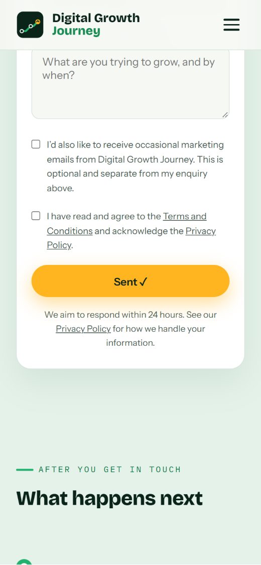
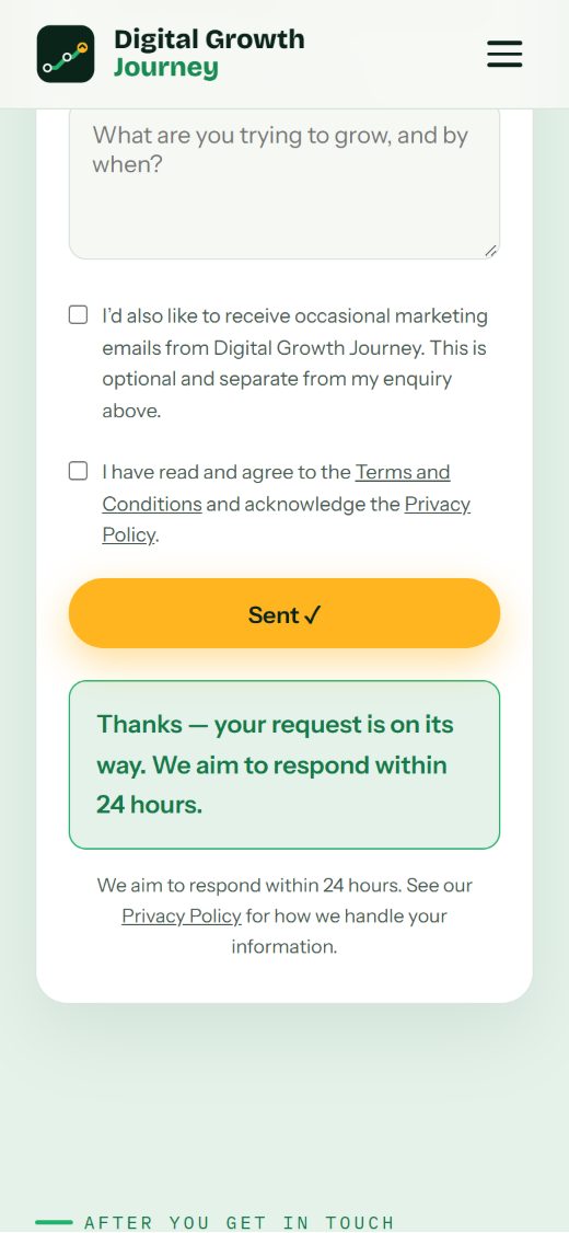
After sending the form on a phone, the confirmation used to appear out of view. The same message, including our aim to respond within 24 hours, now appears directly beneath the button, and screen readers announce it.
-
An easier mobile menu
The menu now closes with the Escape key, returns focus to the menu button, and tells screen-reader users whether it’s open or closed.
-
One name for our free audit
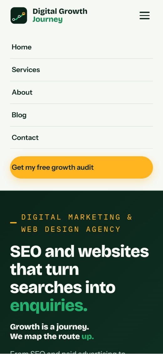
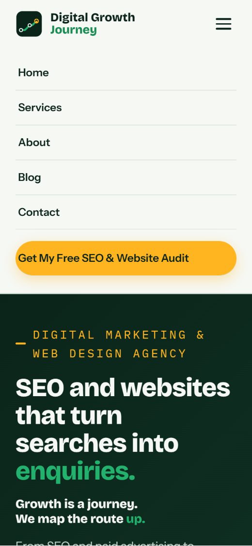
The offer had five different names. It’s now “Free SEO & Website Audit” everywhere, and the header switches to the compact menu below 841 pixels so the longer name always fits.
-
An accurate service count
One homepage line said “nine channels”. It now says eight, matching the eight services we offer.
Before and after
Real screenshots of our own website.
Genuine screenshots of the same part of our own website, captured before and after each change. Form screenshots use a simulated reply in a test browser, so no real enquiry was sent. Select any screenshot to open it full size.
Improvement 1 of 4
Enquiry confirmation on a phone
 (open the full-size screenshot)
 (open the full-size screenshot)
- What changed
- The confirmation’s wording is unchanged. It now appears on screen, directly beneath the submit button, and screen readers announce it.
- Why it matters
- Visitors can see straight away that their enquiry has been received and when to expect a reply, so they don’t need to wonder, send it again or phone to check.
- Evidence
- Both screenshots show our contact page at 390 × 844 pixels (a typical phone) straight after the same simulated successful reply, on the website code before and after the change. Before, the confirmation sat above the visible screen; after, it sits beneath the button. Automated browser tests confirmed this on the private preview and again on the live site.
Improvement 2 of 4
Mobile menu on a phone
 (open the full-size screenshot)
 (open the full-size screenshot)
- What changed
- The menu button now uses the same offer name as the rest of the site. The menu also closes with the Escape key, returns focus to the menu button and switches its label between “Open menu” and “Close menu”.
- Why it matters
- One name for one offer removes any doubt about whether there are different services, and keyboard and screen-reader users can open and close the menu reliably.
- Evidence
- Screenshots of the homepage menu at 390 × 844 pixels. The keyboard changes can’t be seen in a still image; the automated navigation and accessibility checks confirmed them on the final build before release.
Improvement 3 of 4
Desktop header at 1440 pixels wide
 (open the full-size screenshot)
 (open the full-size screenshot)
- What changed
- “Free growth audit” became “Free SEO & Website Audit”. Because the longer name needs more room, the compact menu button now takes over below 841 pixels wide.
- Why it matters
- Visitors see the same offer name from the first screen to the form, and the header never looks cramped on mid-sized screens.
- Evidence
- Desktop header screenshots at 1440 pixels wide. Header spacing was then measured on every page with a standard Windows scrollbar: at least 21 pixels of space at 841 pixels wide.
Improvement 4 of 4
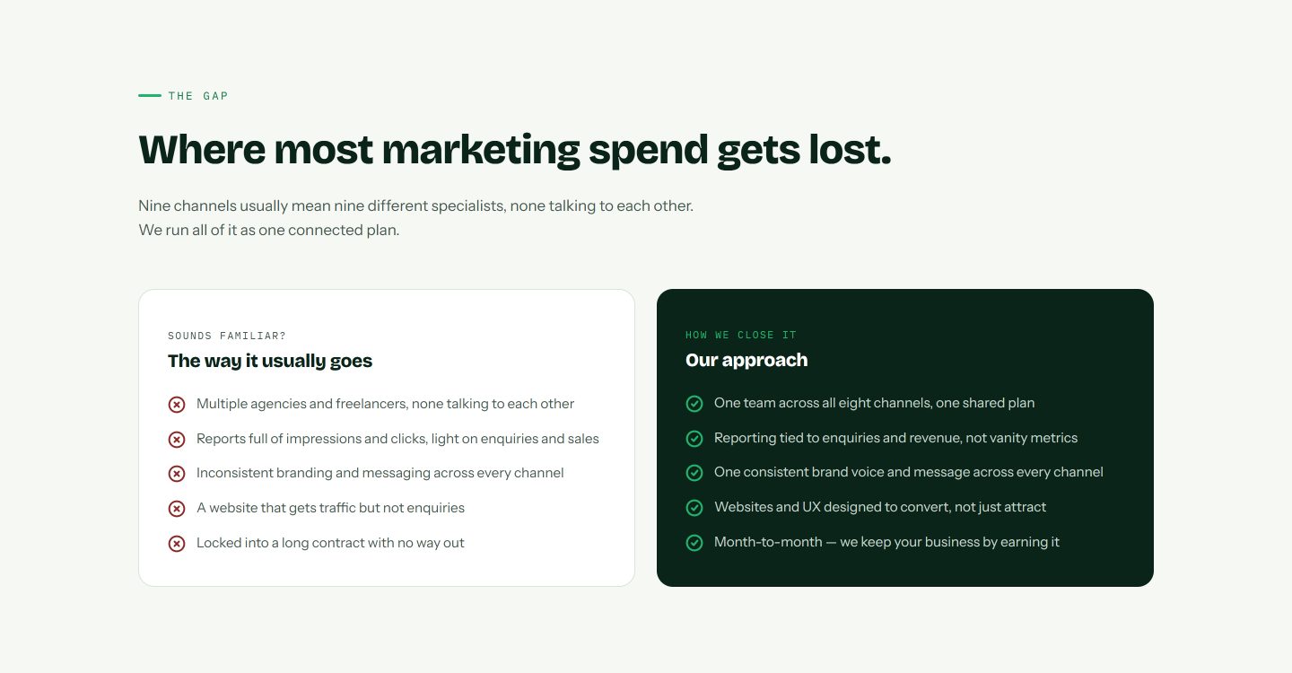
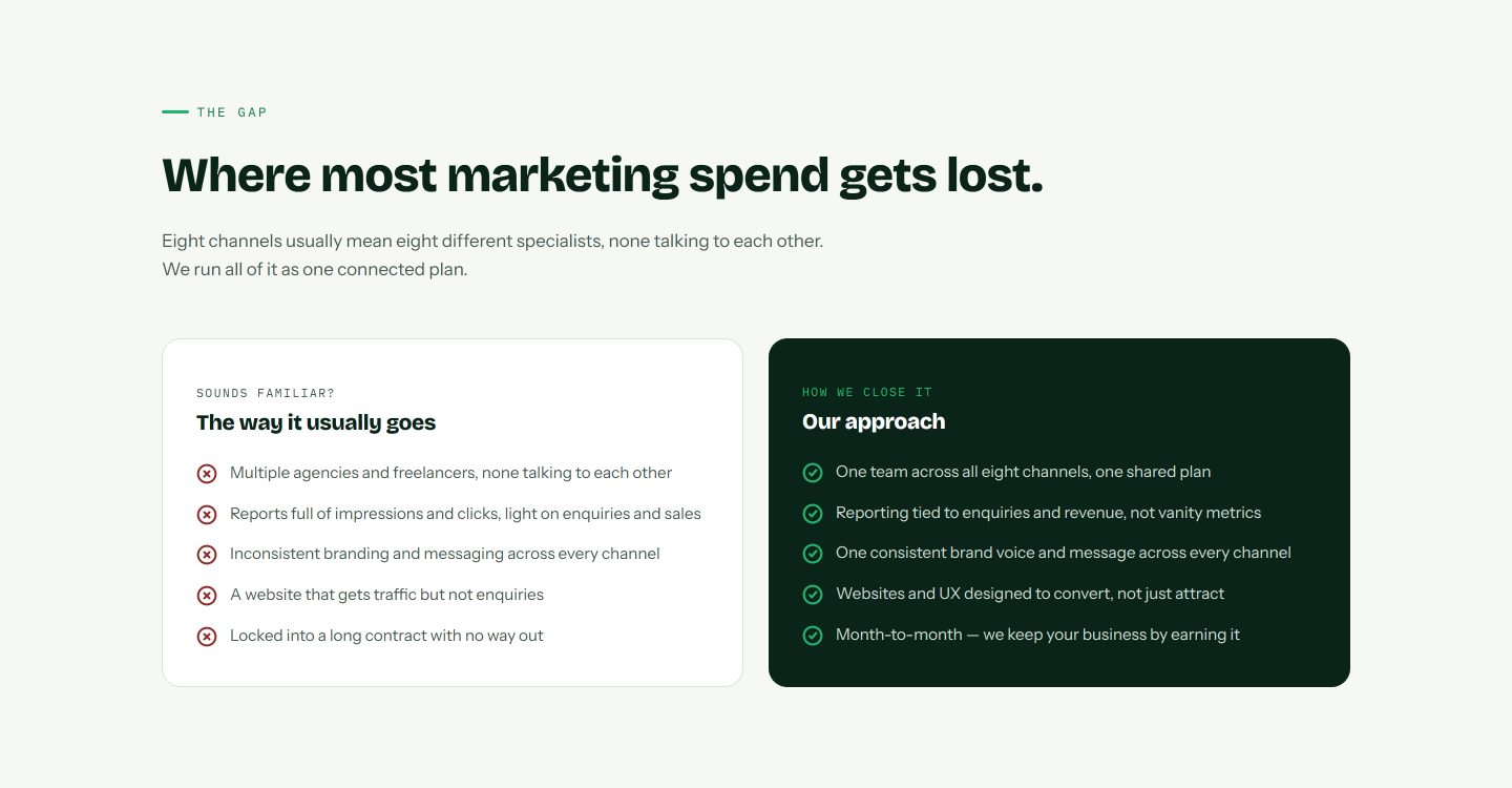
Homepage “The gap” section at 1440 pixels wide
 (open the full-size screenshot)
 (open the full-size screenshot)
- What changed
- “Nine channels” was corrected to “eight channels”.
- Why it matters
- A number that contradicts the services list makes a visitor wonder what else is inaccurate. The homepage now agrees with the rest of the site.
- Evidence
- Screenshots of the same homepage section at 1440 pixels wide. The automated wording checks confirmed the count on every public page before release.
UX testing
We also test what happens when something goes wrong.
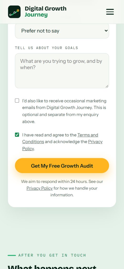
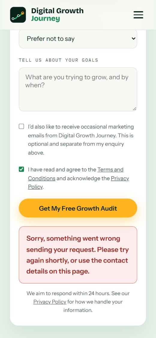
Part of our testing deliberately simulates a failed submission, so a visitor is never left guessing. This was a controlled test in a test browser: no real enquiry failed and nothing was sent.
Test: enquiry form on a phone when sending fails
 (open the full-size screenshot)
 (open the full-size screenshot)
- What changed
- Error messages appear beneath the submit button, are announced to screen readers and use one plain wording.
- Why it matters
- If sending ever fails, the visitor knows immediately and can try again or get in touch another way, rather than assuming the enquiry arrived.
- Evidence
- Both screenshots show the contact page at 390 × 844 pixels straight after the same simulated server error. The button wording is as it was at the time of testing.
How we tested it
Checked before and after release.
Every change was checked with automated browser tests at four screen widths, first on a private preview and then on the live site. Form tests used simulated successful and failed replies, so no real enquiries were sent.
View testing details
- Enquiry forms: browser tests on the homepage and contact forms at 360, 390, 768 and 1440 pixels, covering successful and failed submissions with simulated replies. Every check passed locally, on the private preview and again on the live site after release.
- Wording, navigation and accessibility: 155 automated checks across every public page passed on the final build before release.
- Accessibility: automated checks with axe-core, plus keyboard and screen-reader behaviour of the mobile menu.
- Header spacing: measured on every page with a standard Windows scrollbar: at least 21 pixels of space at 841 pixels wide.
- Regression checks: cookie consent, analytics loading, link tracking and responsive layouts were re-tested after every change.
- Performance: lab checks with Lighthouse during the original review.
About this evidence
The screenshots are genuine captures of our own website before and after each change. Form screenshots and tests used simulated replies in a test browser: they show how the page behaves, not that an email was delivered. We haven’t measured changes in enquiries, search rankings or revenue, so we don’t claim any.
What we learned
Small improvements make a real difference.
-
Test how visitors really behave
The confirmation looked fine on a desktop. The problem only appeared on a phone, which is why we test at several screen sizes.
-
Consistent wording builds confidence
One offer with five names makes visitors wonder whether they’re different things.
-
Small changes can move other things
A longer button name affected the header layout, which we caught by measuring every page at every width.
Could your website benefit from similar improvements?
Your website should help customers understand your business, find what they need and contact you with confidence. We’ll review your website and explain what we find, in plain English.
Start with a Free SEO & Website Audit