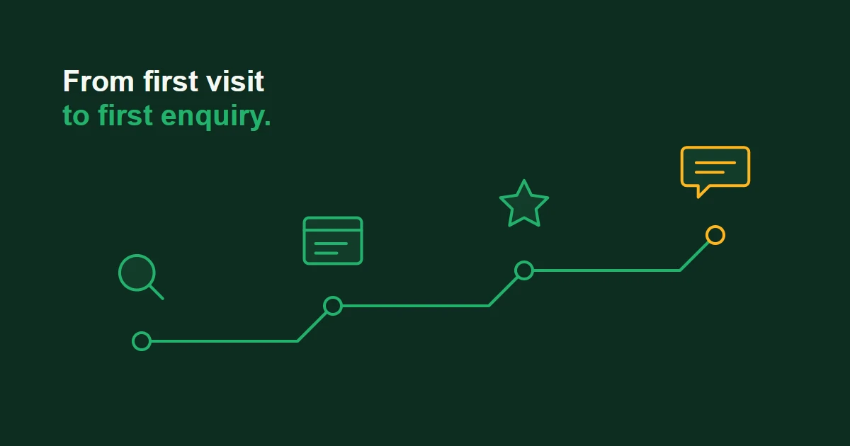
User journey optimisation means looking at the steps a customer takes on your website — from first finding you to getting in touch or buying — and removing whatever slows them down or makes them give up along the way. You don't need a new website or a big budget to start. You need to see your website the way a first-time visitor does, one step at a time.
This guide explains what that looks like for a small business, where visitors most often drop out, and how to start improving your own customer journey this month.
What user journey optimisation actually means
Every enquiry you receive is the end of a short journey. Someone has a problem, searches for help, lands on one of your pages, decides whether you look right for them, and then works out how to get in touch. If any one of those steps is confusing, slow or missing, some people stop there — and you never know they were interested.
The "user journey" is that route from first visit to enquiry or purchase. "Optimisation" simply means making each step easier, clearer and more reassuring, so more of the people who are already visiting carry on to the next step.
It's different from a redesign. A redesign changes how the whole website looks. Journey optimisation is more focused: it looks at the specific route that leads to a sale or enquiry, finds the points where people drop out, and fixes those first.
What a small business customer journey looks like
Customer journeys are usually shorter and simpler than people expect. Two typical examples:
A local service business
A homeowner's boiler stops working. On their phone, they search for a heating engineer in their area and tap one of the results. Within a few seconds they're asking three questions: do you cover my area, can you help with this problem, and how quickly can I reach you? If the page answers those quickly — and the phone number or booking button is easy to find — they get in touch. If they have to hunt for any of it, they go back to the search results and tap the next business.
A business-to-business service
A café owner wants help with their bookkeeping. They read one of your articles, leave, and come back a week later by searching for your business name. This time they look at your services page, check what working with you involves and look for signs you're trustworthy — reviews, clear contact details, a real person to speak to. Then they decide whether to fill in your enquiry form or book a call.
Both journeys have the same basic stages: arrive, understand, trust and act. Most lost enquiries happen because one of those stages isn't working.
Where visitors usually drop out
The most common breaking points for small business websites are:
- Arriving on the wrong page — the page someone lands on doesn't match what they searched for or clicked on, so they leave before they've really started.
- Not understanding what you do — the page talks about the business in general rather than answering the visitor's specific question.
- No obvious next step — the page ends without telling the visitor what to do next, so they don't do anything.
- Not enough reassurance — no reviews, no real contact details, or no idea what happens after they get in touch.
- Too much effort at the last step — long forms, buttons that are hard to tap on a phone, or a form that asks for information they don't have to hand.
We look at several of these problems in more detail in why your website gets traffic but no enquiries. The rest of this guide focuses on how to find which of them is affecting your own website.
How to map your own customer journey
You can do a useful first version in an afternoon.
Step 1: Choose the action that matters most
Pick the one action you most want visitors to take — a quote request, a booked call, a phone call or a purchase. Focusing on one journey at a time keeps the work manageable.
Step 2: Write down how people arrive
List the main ways people find you: Google searches, adverts, social media, recommendations. Note which page each route usually lands on. Visitors from an advert and visitors from a recommendation often arrive on different pages, with different questions.
Step 3: Walk the journey yourself — on a phone
Open your website on your phone as if you were a stranger with a problem to solve. Start on the page people actually land on, not your homepage. At each step, write down anything that made you hesitate, scroll looking for something, or think "where do I click now?". Better still, ask a friend who doesn't know your business to try it while you watch without helping.
Step 4: Check what your data says
If you have website analytics set up, look at which pages people land on, which pages they leave from, and how many people start your enquiry form compared with how many finish it. You don't need complicated reports — a few clear numbers will show you where the biggest drop-off is. If your tracking can't show this yet, it's worth setting up before you change anything — see how we approach analytics and reporting.
Step 5: Ask your customers
Some of the best evidence is a short conversation. Ask recent customers what nearly stopped them getting in touch and what convinced them in the end. Their answers often point straight at the step that needs fixing.
Step 6: Fix one thing at a time
Start with the step where the most people drop out, make one improvement, and give it time before changing anything else. That way you'll know which changes actually made a difference.
Practical improvements most small businesses can make
Once you know where people are dropping out, the fixes are often simple:
- Match each landing page to its visitors. Make sure the first thing on the page answers what someone searching for that service is likely to want to know.
- Give every important page a clear next step. One obvious button or link — "Get a quote", "Book a call" — beats several competing options.
- Put reassurance where decisions are made. Reviews, a real phone number and a note on how quickly you respond work best next to the enquiry form, not hidden on another page.
- Ask only for what you need. If a name, an email address and a short message are enough to start a conversation, don't make visitors fill in more.
- Make it easy on a phone. Buttons big enough to tap, text readable without zooming, and pages that load quickly on mobile data.
- Say what happens next. After someone gets in touch, confirm that their message arrived and tell them when to expect a reply.
If several of these point to deeper problems with how your website is built, it may be worth checking the signs your website needs a redesign. Most journeys, though, can be improved without starting again.
Why this matters for enquiries
Many small businesses try to grow by getting more visitors — more advertising, more social posts, more SEO. All of that can help, but if the journey on your website is leaking people at the same points, extra visitors leak away in the same places.
Improving the journey works the other way round: it helps more of the people who already visit you to become enquiries. It also makes every other channel work harder, because the visitors you pay for or work to attract are more likely to carry on to the next step.
When it makes sense to get help
You can make a real difference on your own by walking the journey, talking to customers and fixing the obvious obstacles. Outside help becomes more useful when your data doesn't give clear answers, when you're paying for traffic and every lost visitor costs money, or when you've fixed the obvious problems and people are still dropping out without an obvious reason.
FAQs
Is user journey optimisation the same as UX?
They're closely related. UX (user experience) covers how easy and pleasant your whole website is to use. User journey optimisation focuses on one part of that: the specific route a visitor takes towards an enquiry or purchase, and the points where they drop out.
Do I need a lot of website traffic before this is worth doing?
No. Even with modest traffic, you can walk the journey yourself, ask a few customers what nearly put them off, and fix the obvious obstacles. Larger amounts of traffic mainly help when you want to compare two versions of a page and trust the result.
Do I need a new website to improve my customer journey?
Usually not. Clearer page wording, a more obvious next step, a shorter form or reviews placed near the enquiry button are all changes most websites can make without being rebuilt.
How do I know if my changes are working?
Measure the action you care about — enquiries, calls or sales — rather than visits alone. Compare a similar period before and after each change, and make one change at a time so you can tell what made the difference.
What's the difference between a customer journey and a sales funnel?
A sales funnel describes the stages people move through, usually from the business's point of view. A customer journey looks at the same process from the customer's side: what they're trying to do, what they need to know, and what might make them hesitate at each step.
The bottom line
User journey optimisation is about making it easy for the right people to go from "this looks interesting" to "let's get in touch". Map the route your customers actually take, find where they drop out, and fix the biggest obstacle first. Small, focused changes often do more than a complete redesign.
If you'd like help mapping and improving your own customer journey, see what our UX & Conversion Optimisation service involves, or get in touch for a free growth audit.